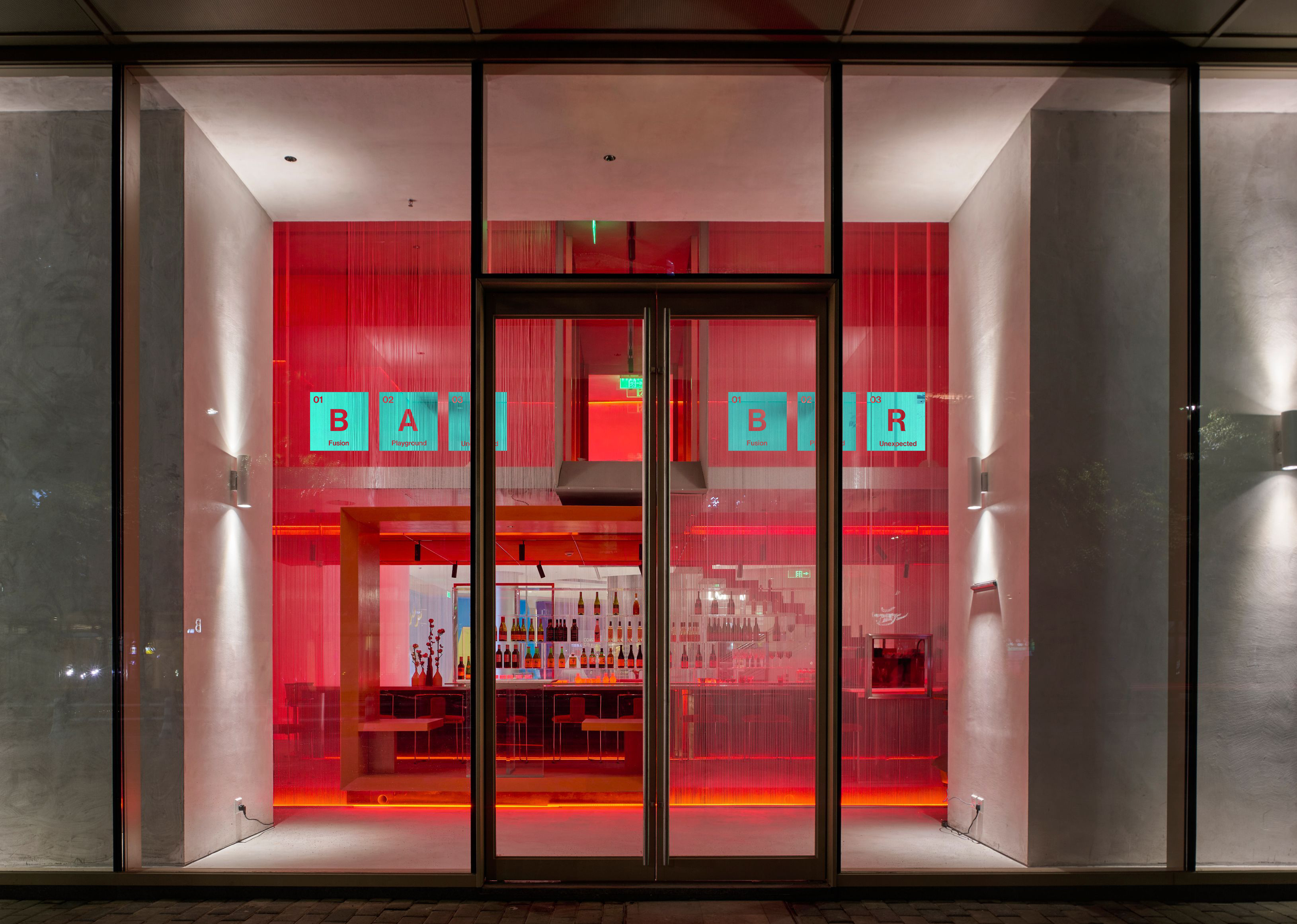
J+ Lab (Hospitality, Rebrand)
Mentor: Annie Huang Luck
Dr. Jart+ products are powered by science and inspired by art. The hypothetical hotel is a getaway experience that focuses on capturing the balance between the components of skincare—internal feelings and external sensation, the aesthetic and the remedial. The science aspect will promote sleep and fitness for a healthier skin and body, while the art aspect will promote culture through exhibitions, galleries, and art studios.
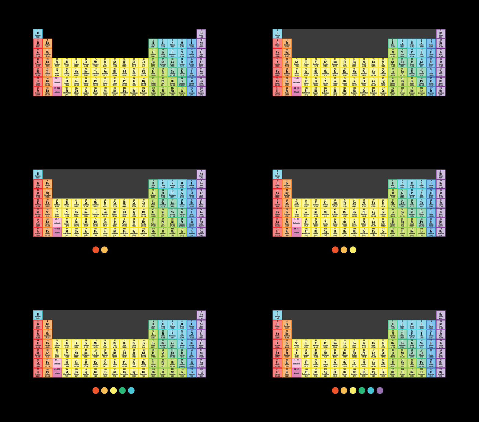
Visual Development Concept
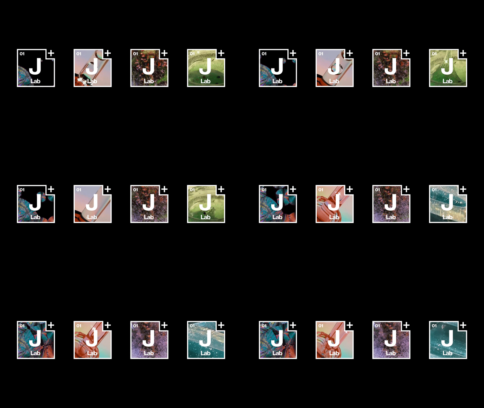
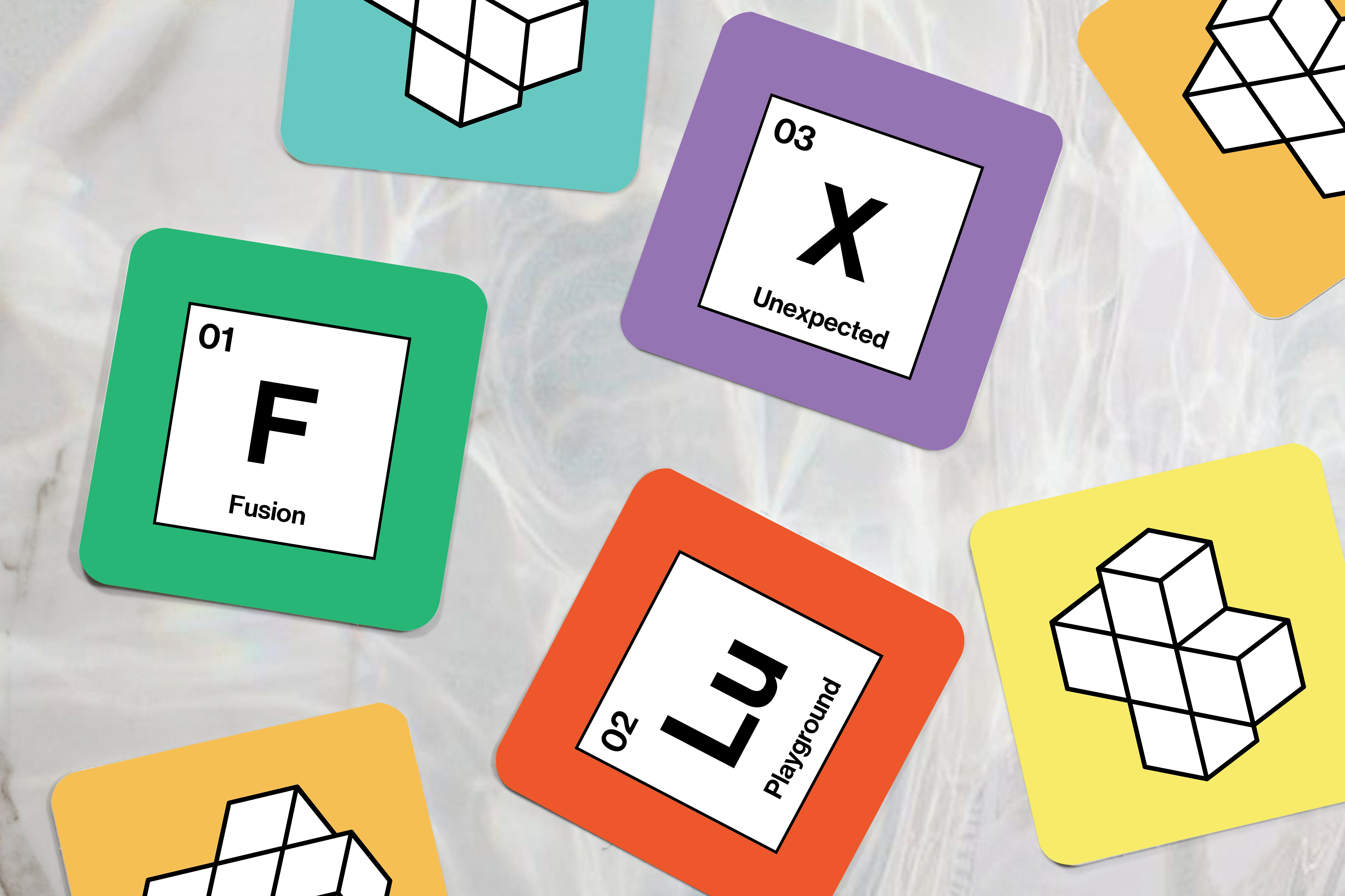
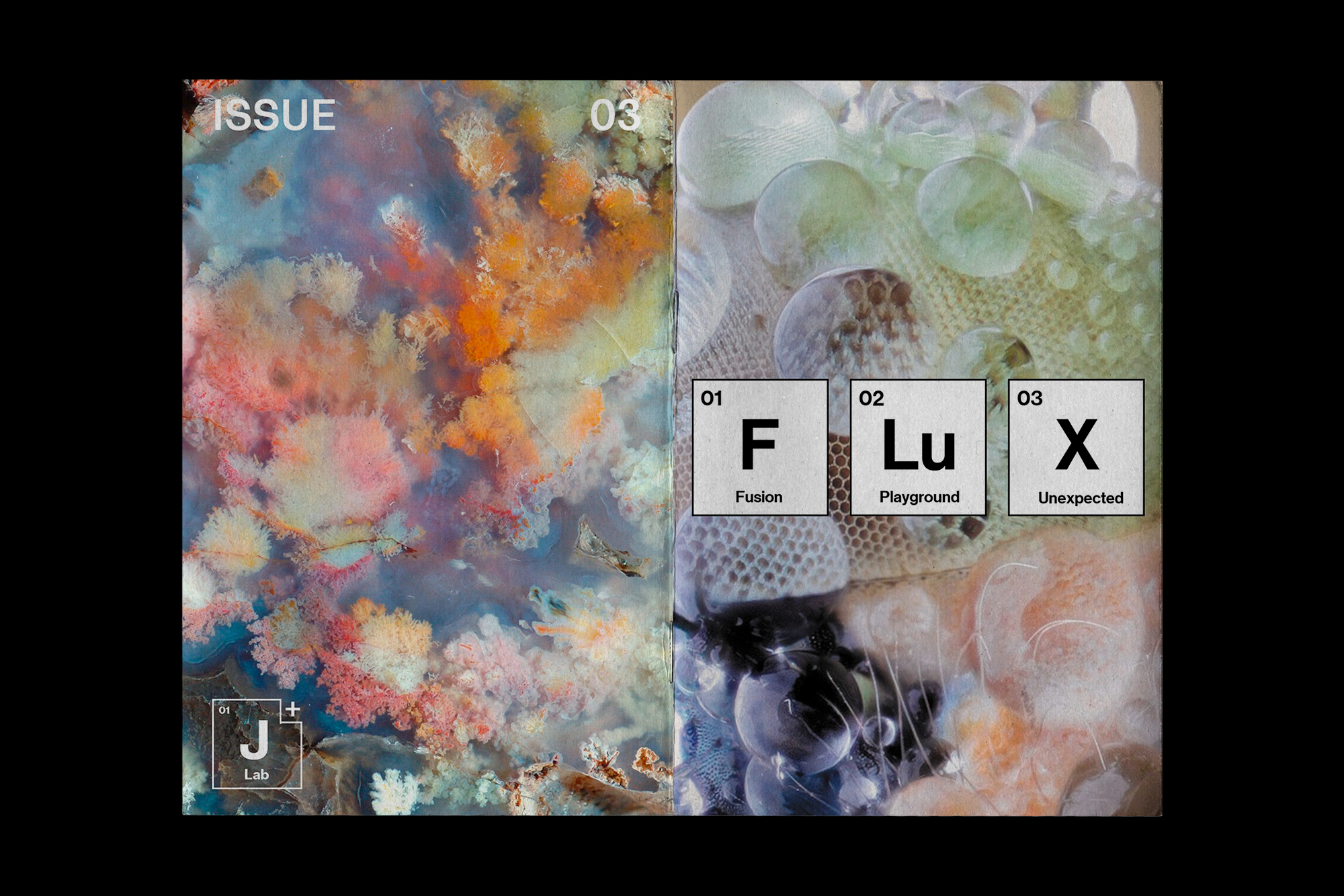
The main challenge for J+ Lab was to create a visual identity that speaks to both science and art, which are often times considered as polar opposites. The new logo and colors are inspired by the scientific periodic table, which speaks to how their products are powered by science, but also adding an indent to the periodic frame so that it creates a playful art sense.

Logo Development
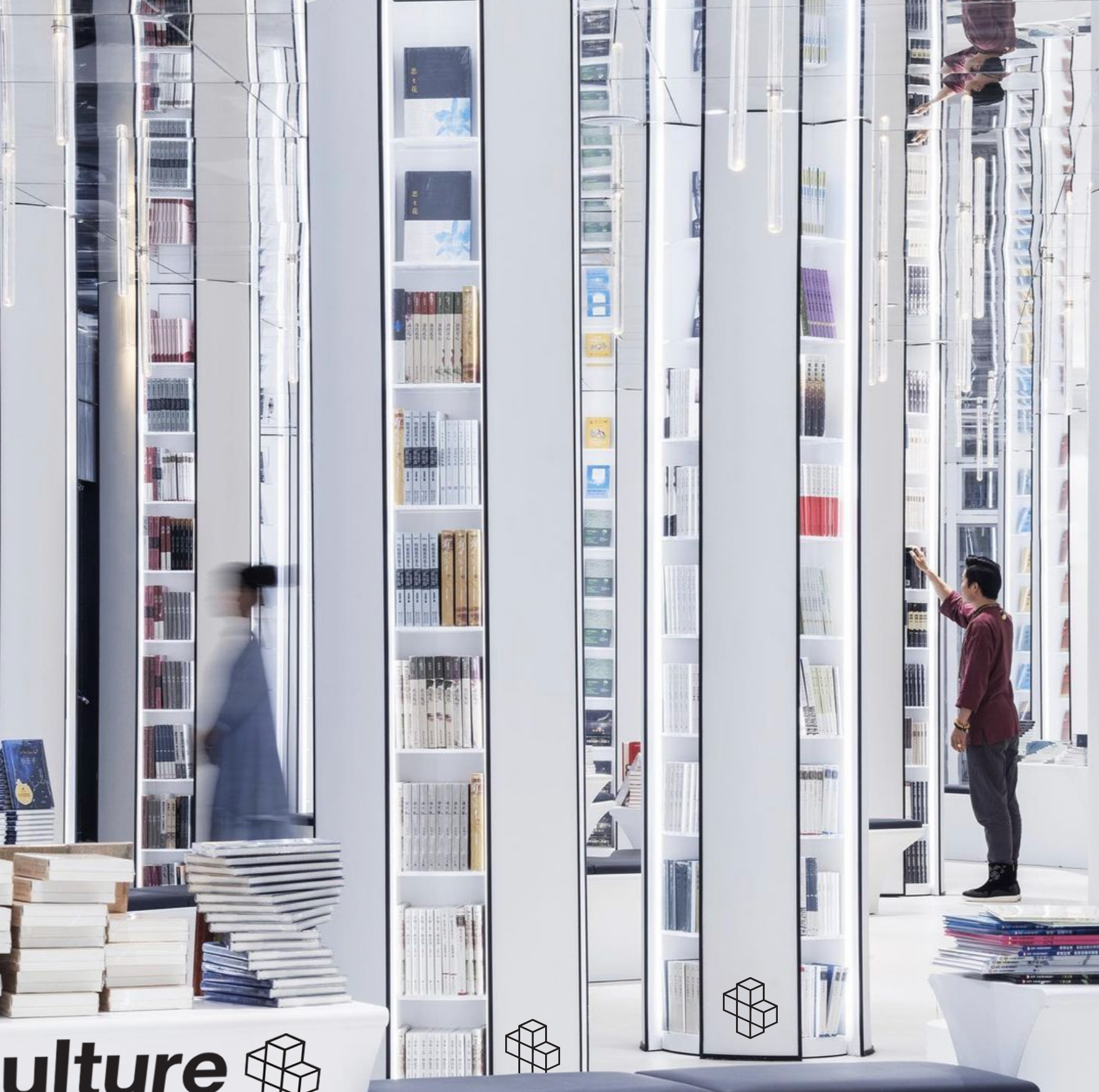
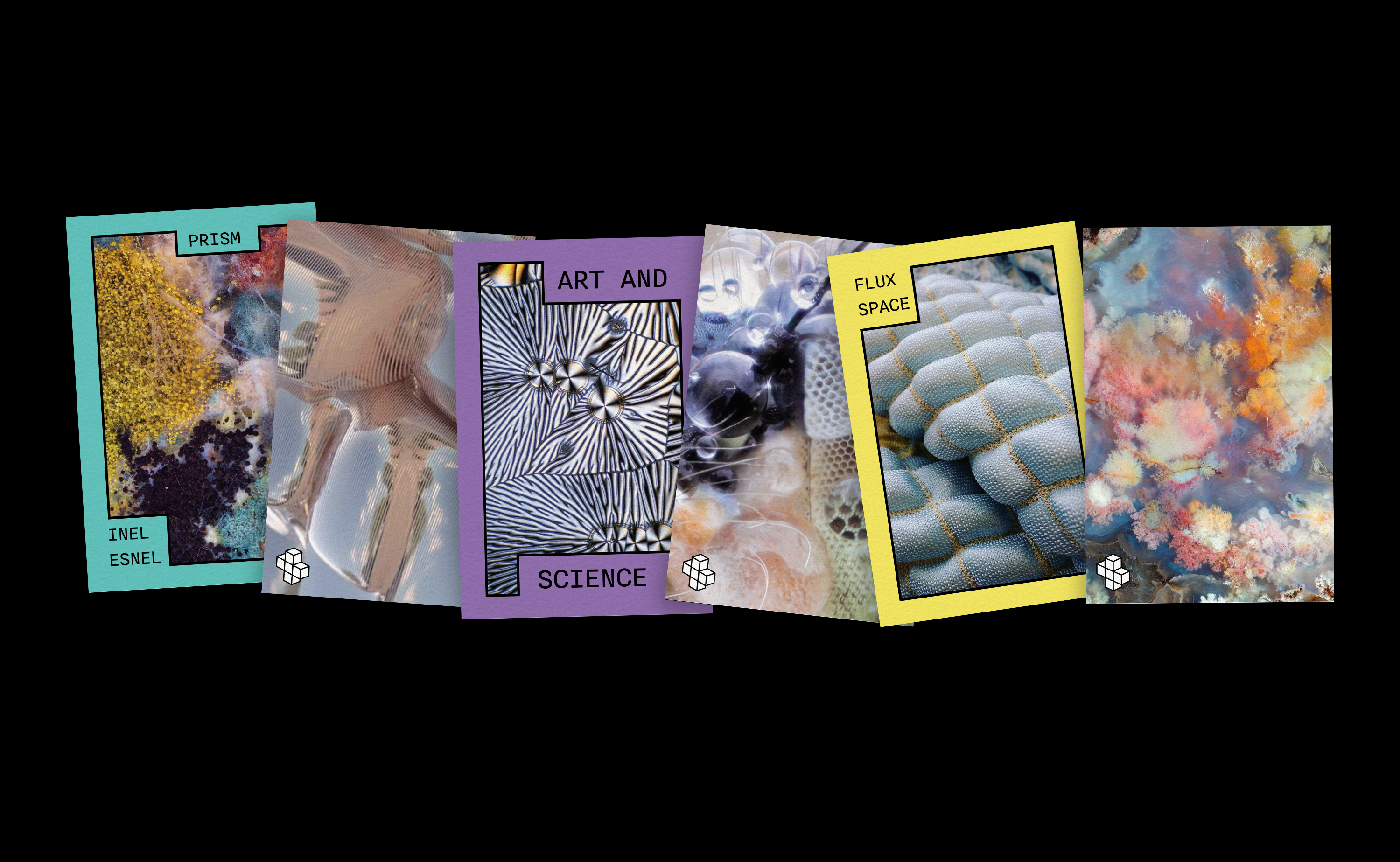
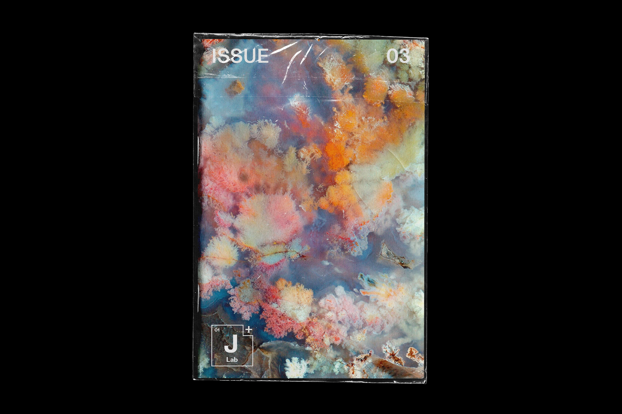
A 3D version of the plus was created to reinforce the dynamic nature of the brand. This 3D plus is also used to activate various visual systems. The strategy for image and video curation was to look at microscopic images that looked like art. In a way it’s combining science, and looking at how these microscopic elements can be seen as art too.
Postcards


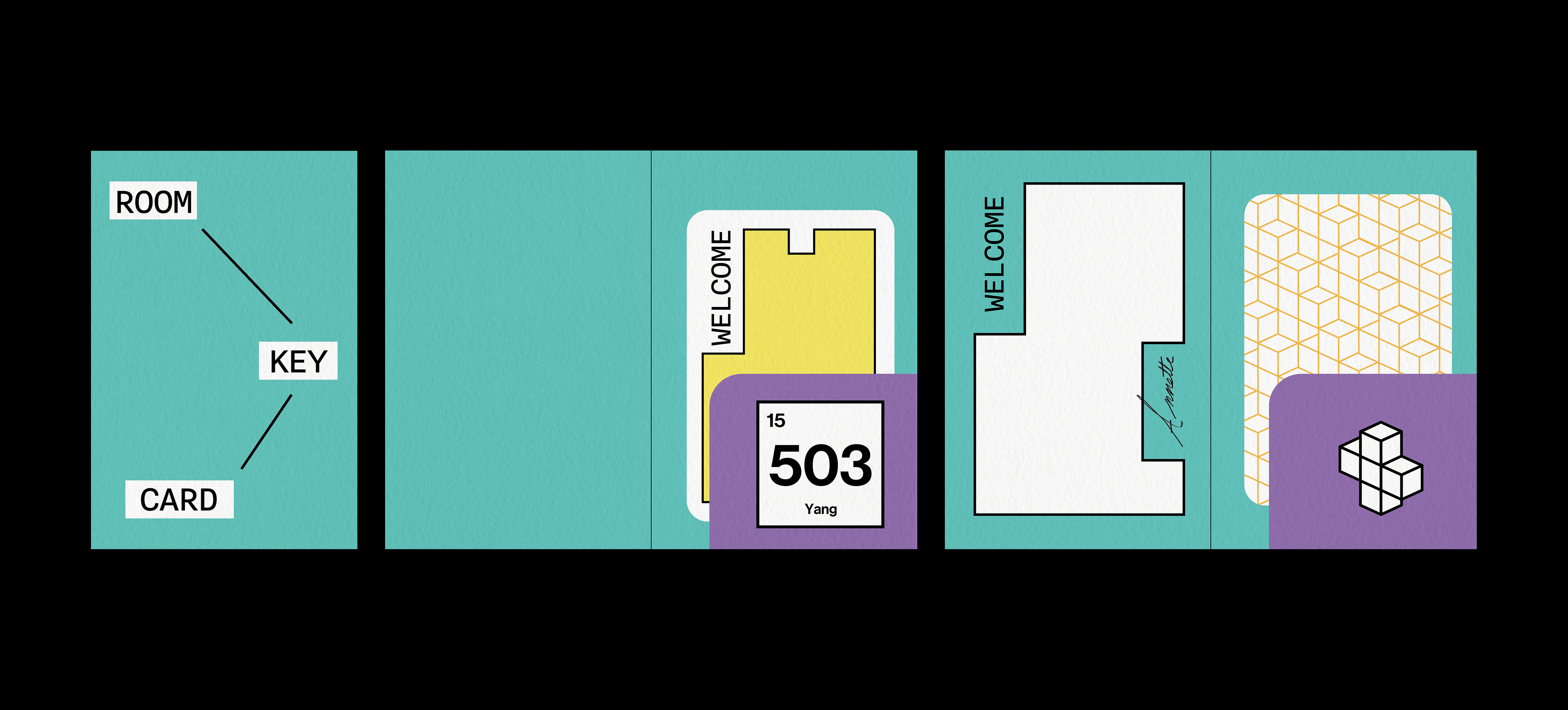
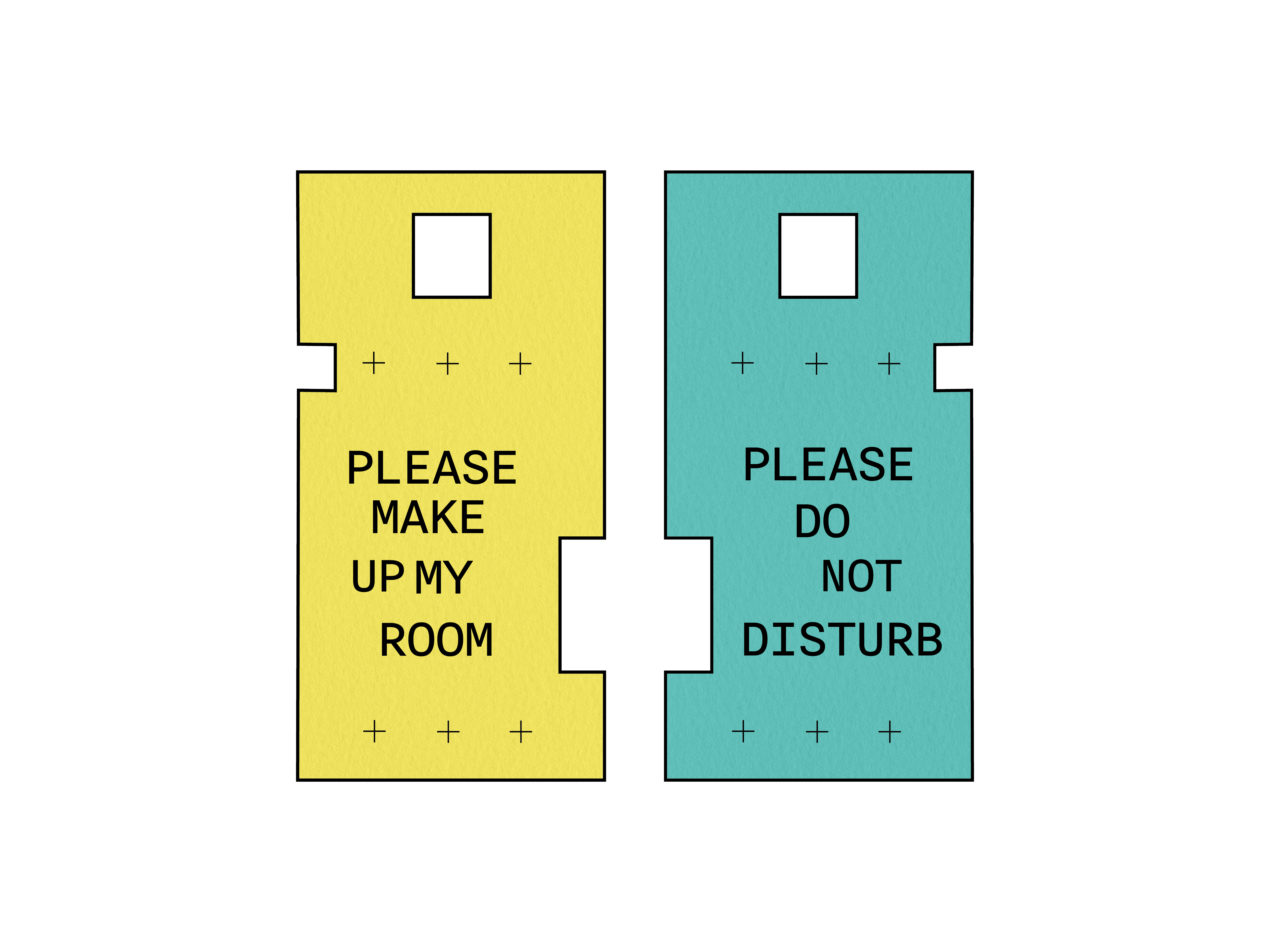
Collaterals
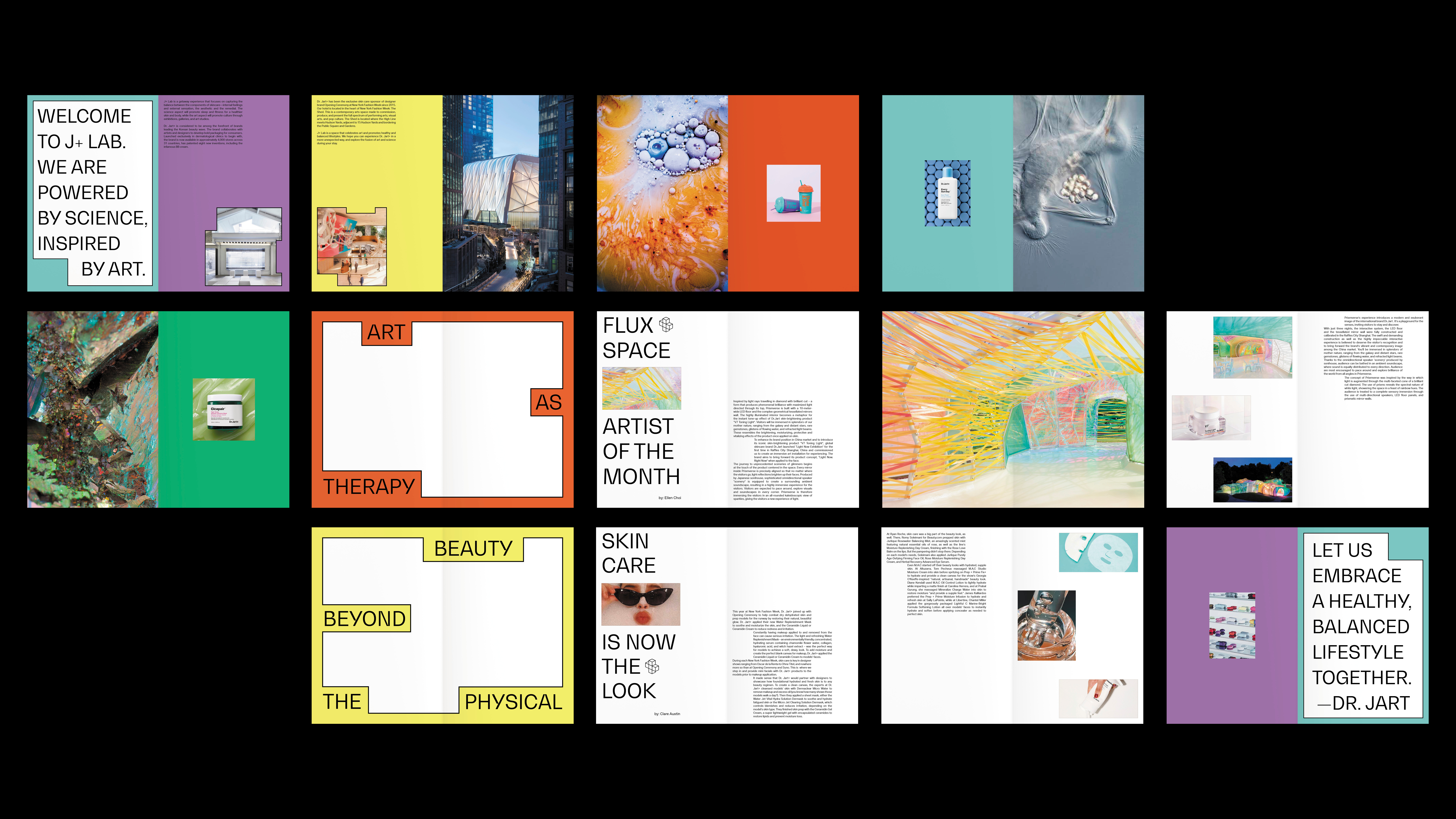
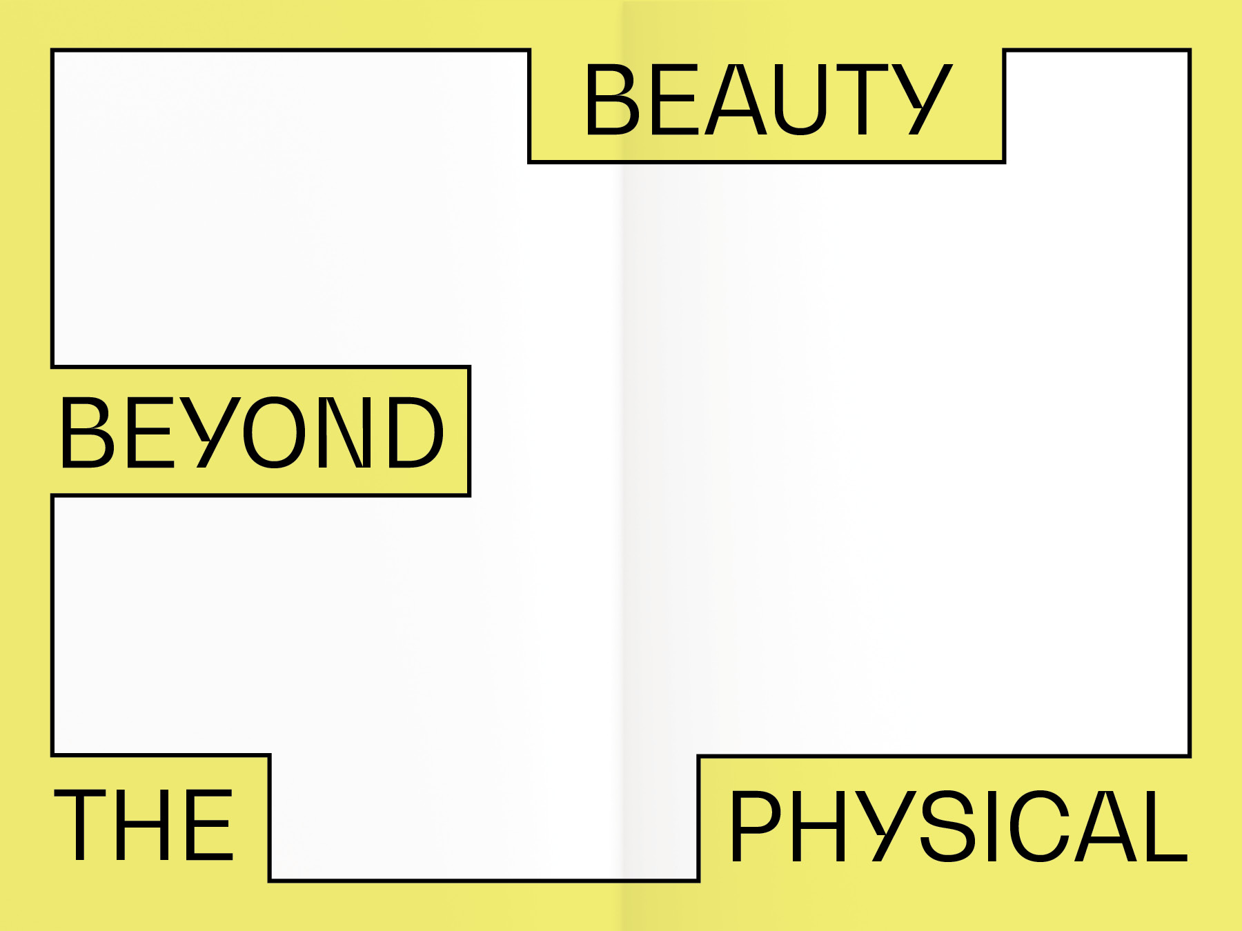
Look Book

Instagram Page
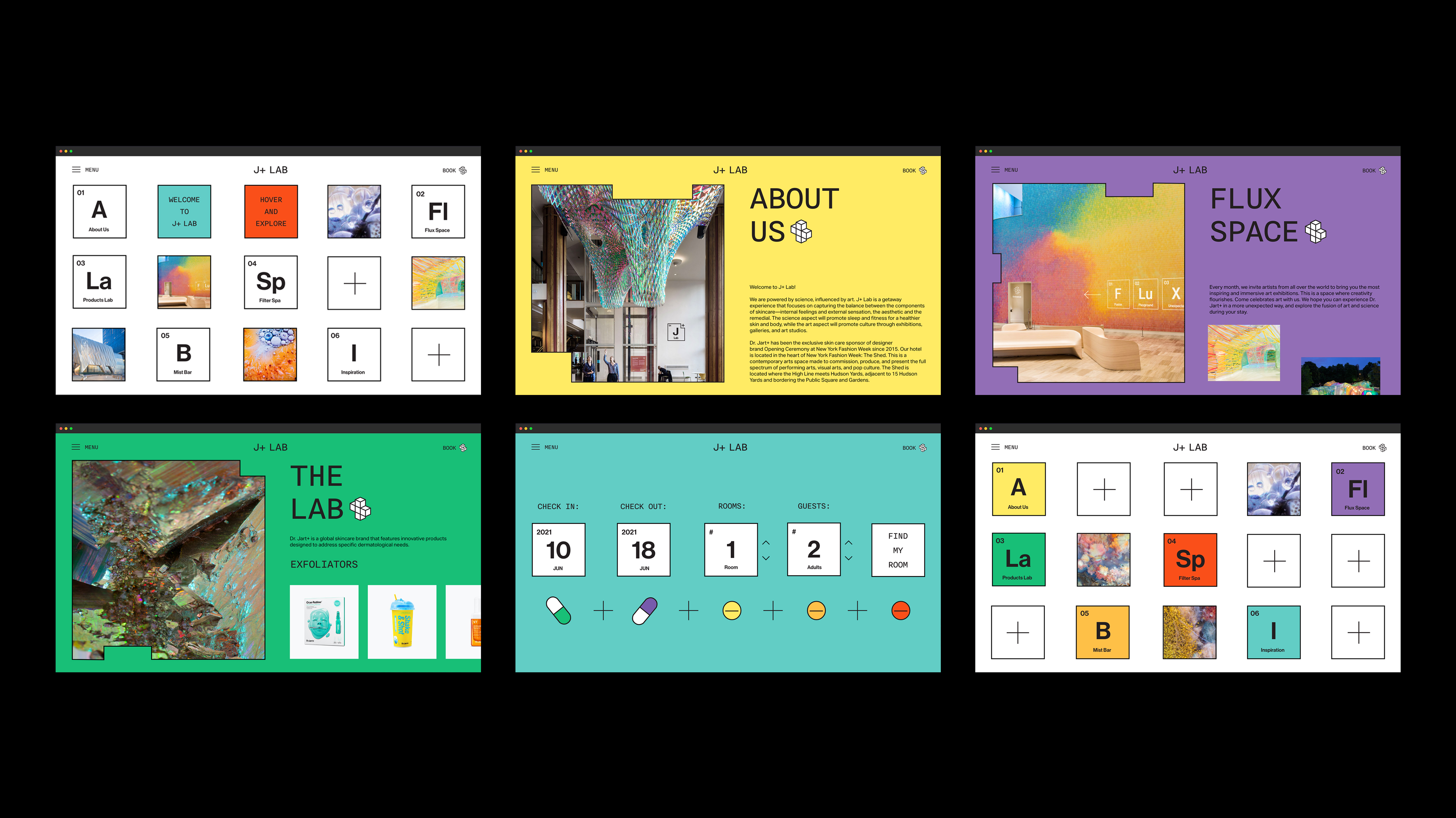
Website
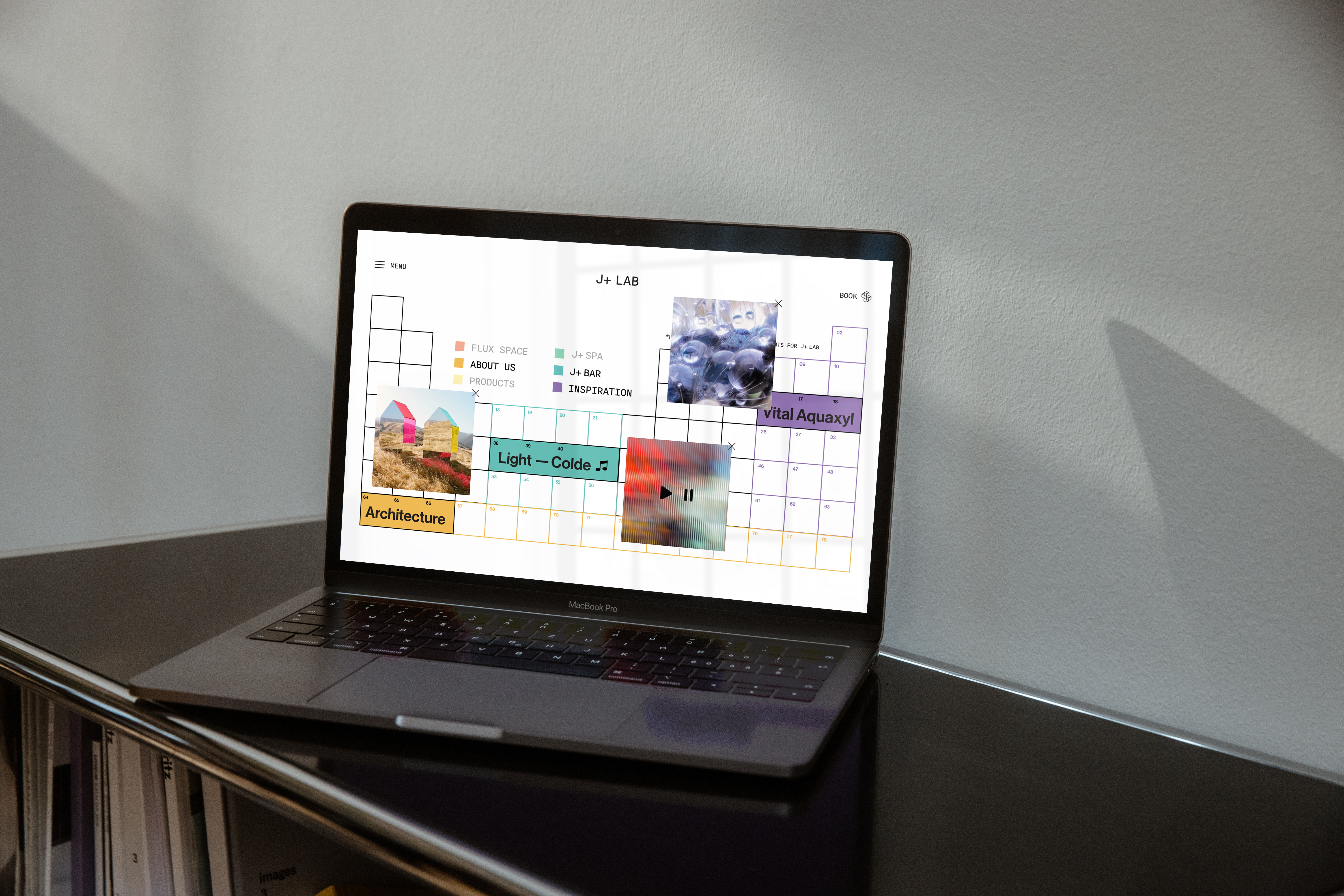
Inspiration Page
The inspiration page is an interactive experimental lab where the users get to mix and open different tabs that speak to J+ Lab’s architecture inspiration, music that represent the brand, some of the elements used in their products. And all of these can be moved or arranged to create their own lab mixture.
Turn on video sound to get the best experience!
Turn on video sound to get the best experience!
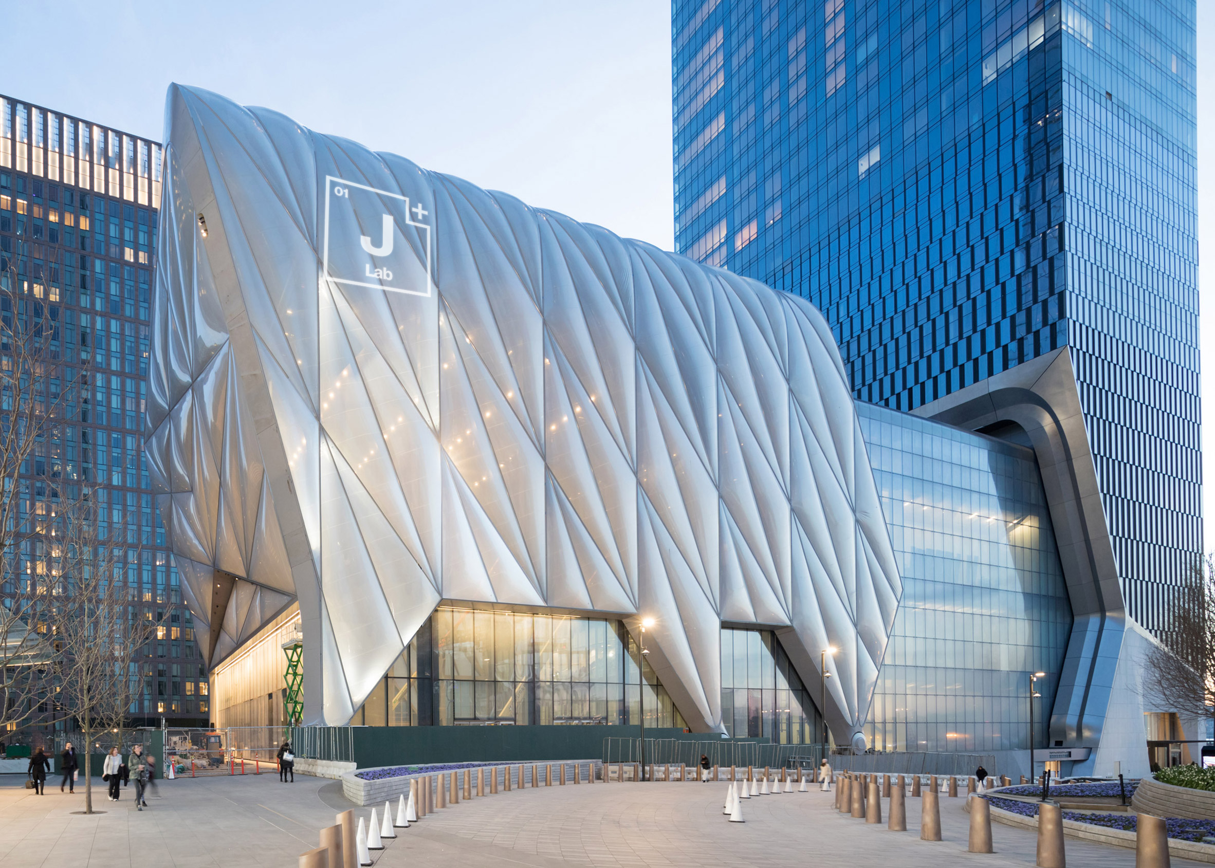
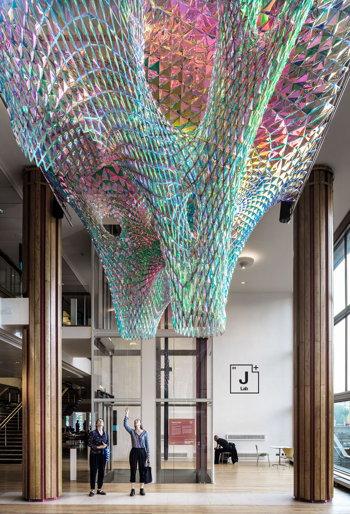
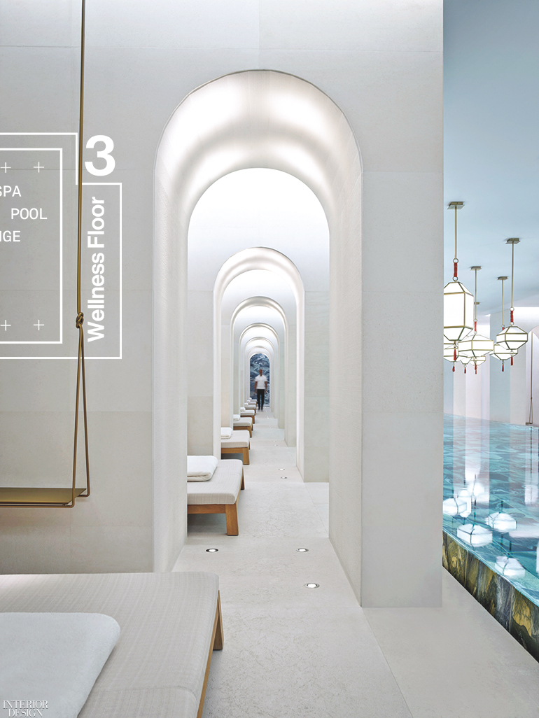
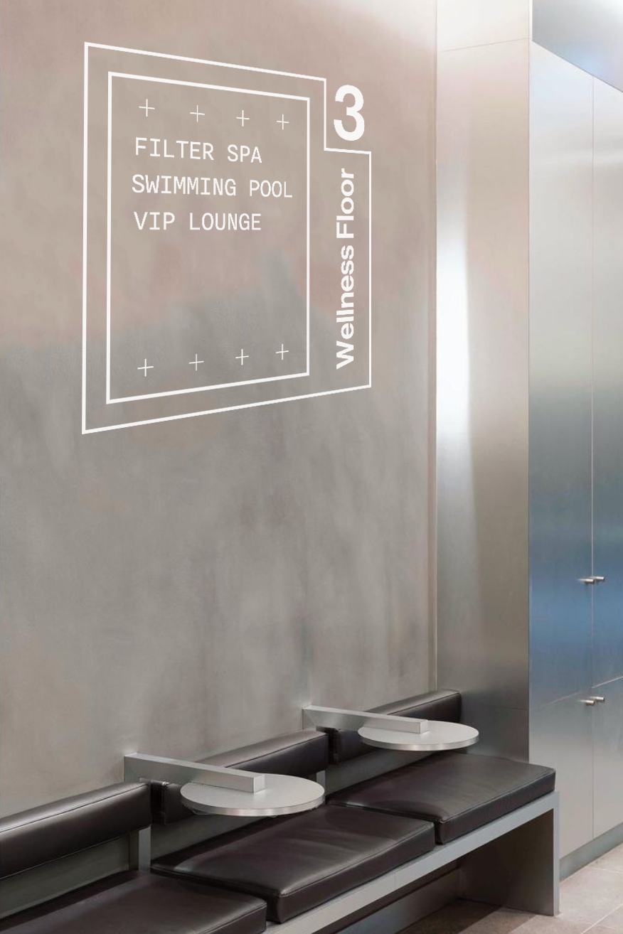
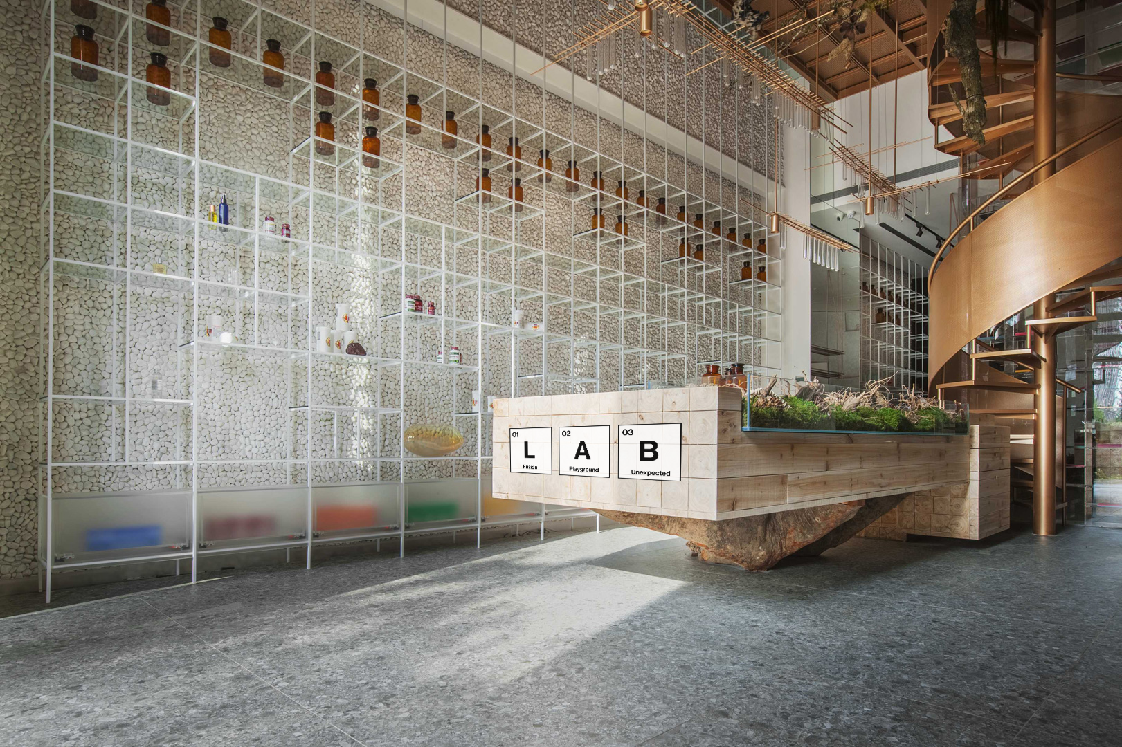
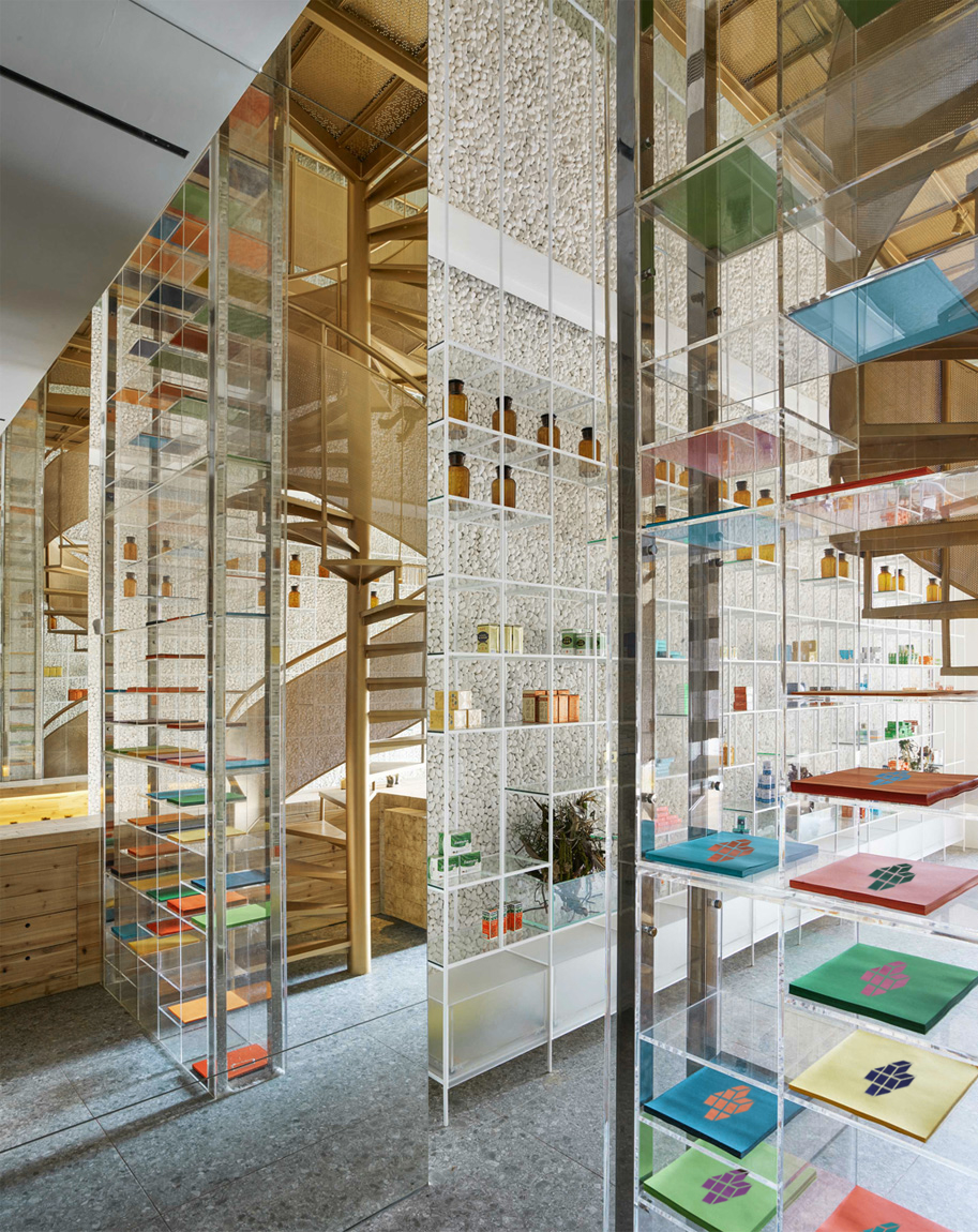
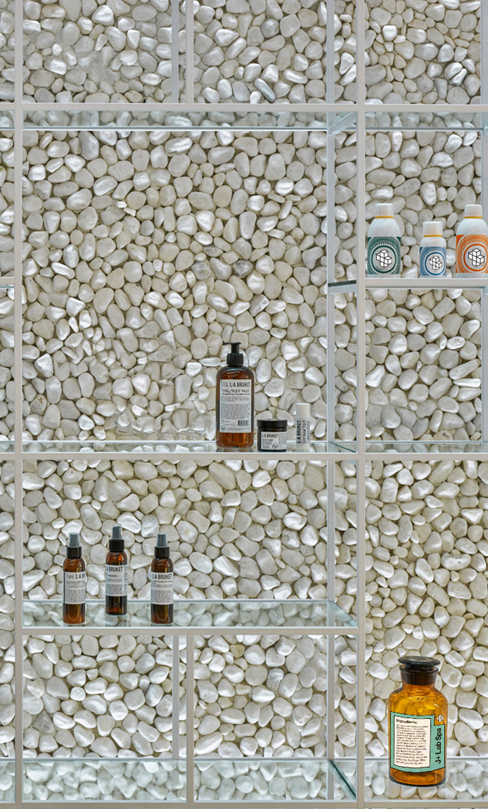
Spatial
