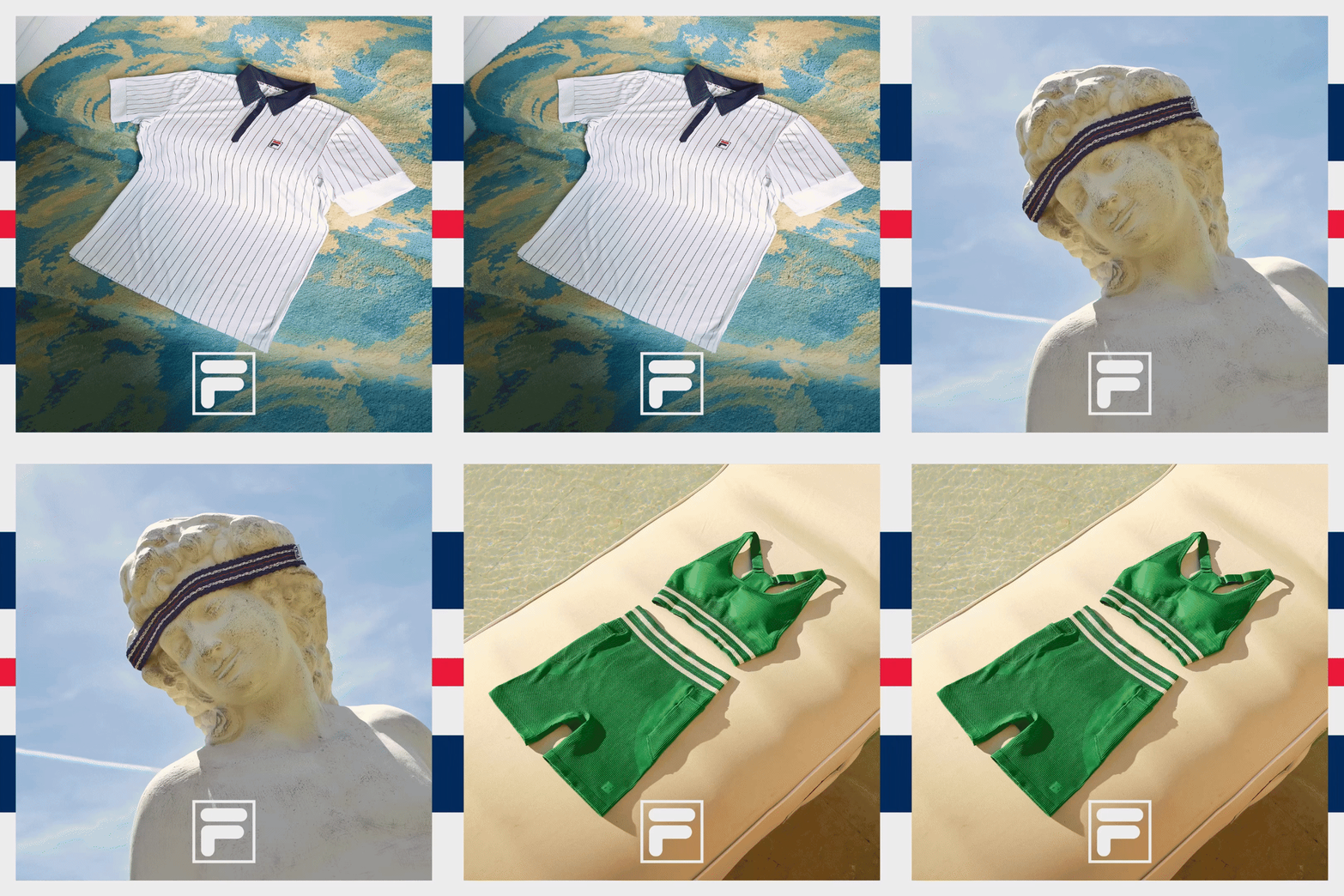
FILA (360 Campaign, Identity)
Agency: Sid Lee
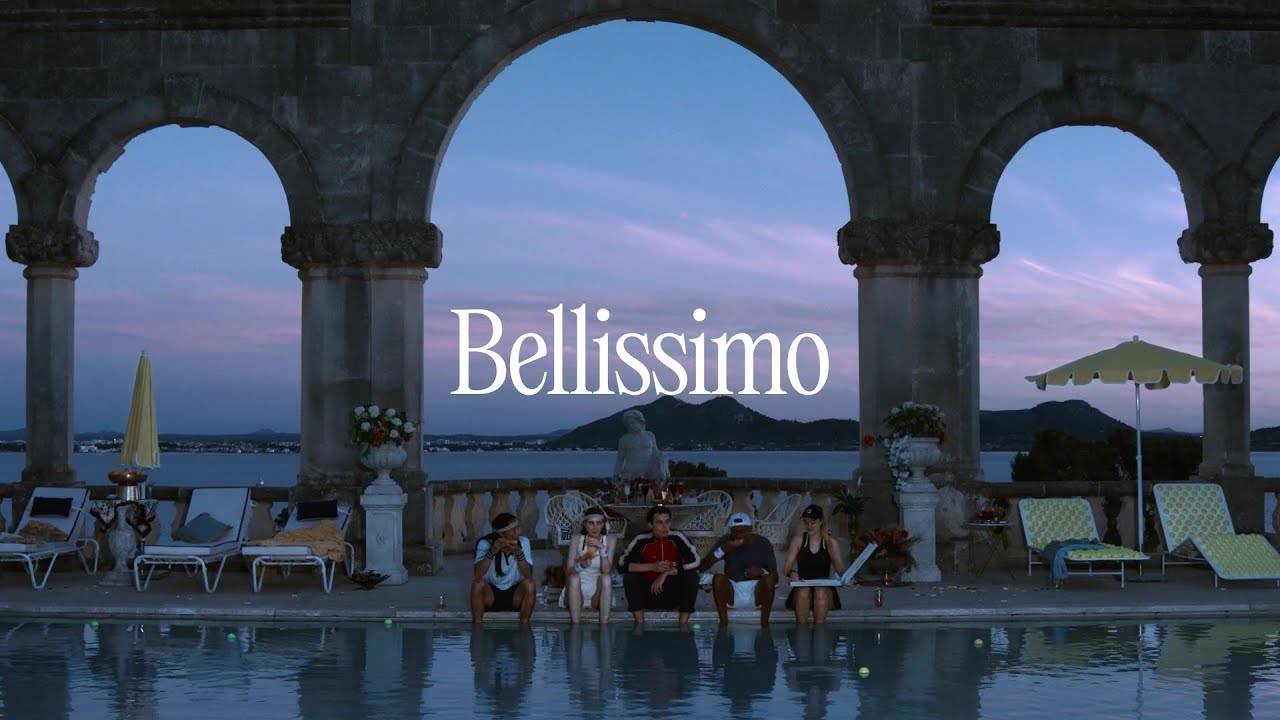
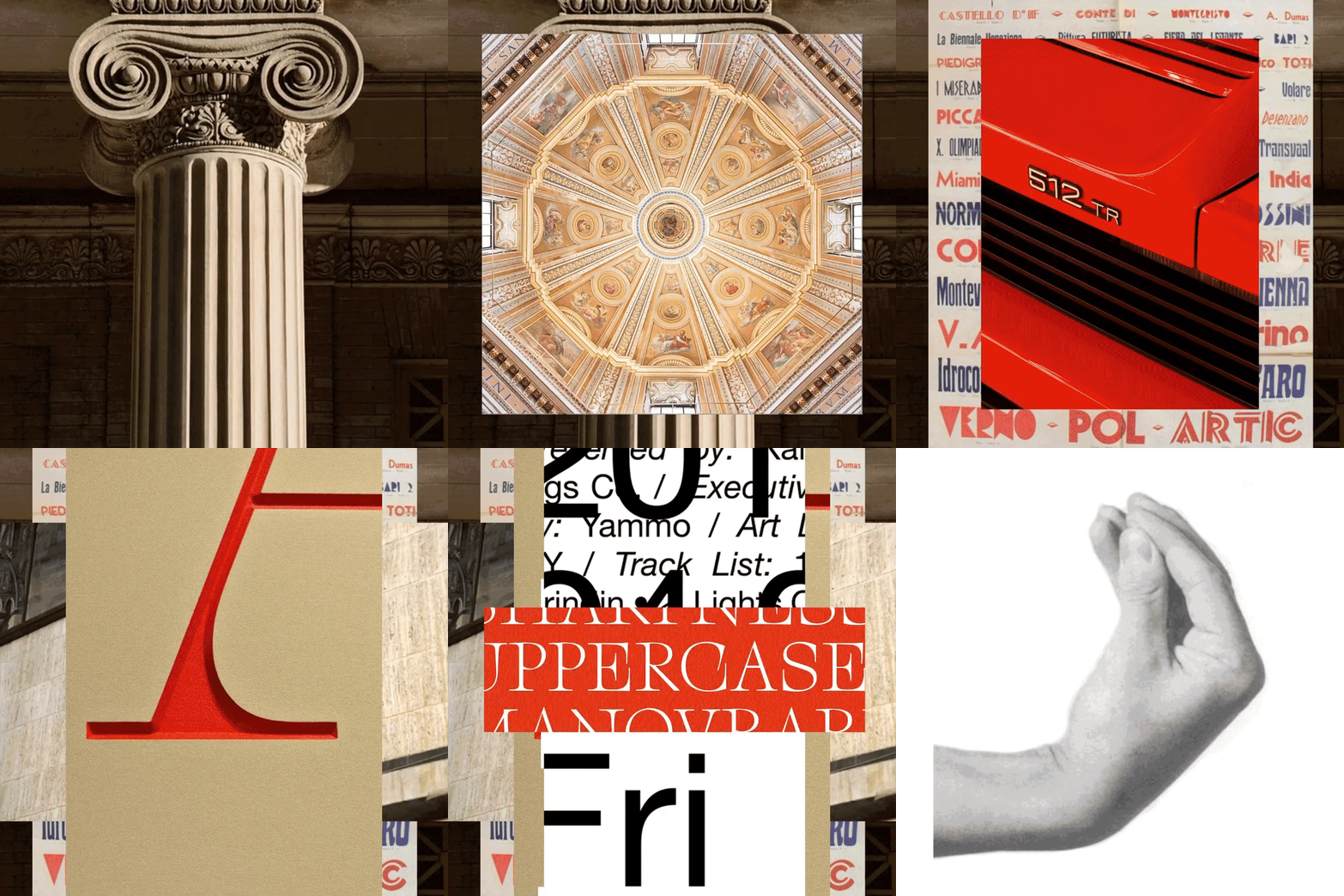
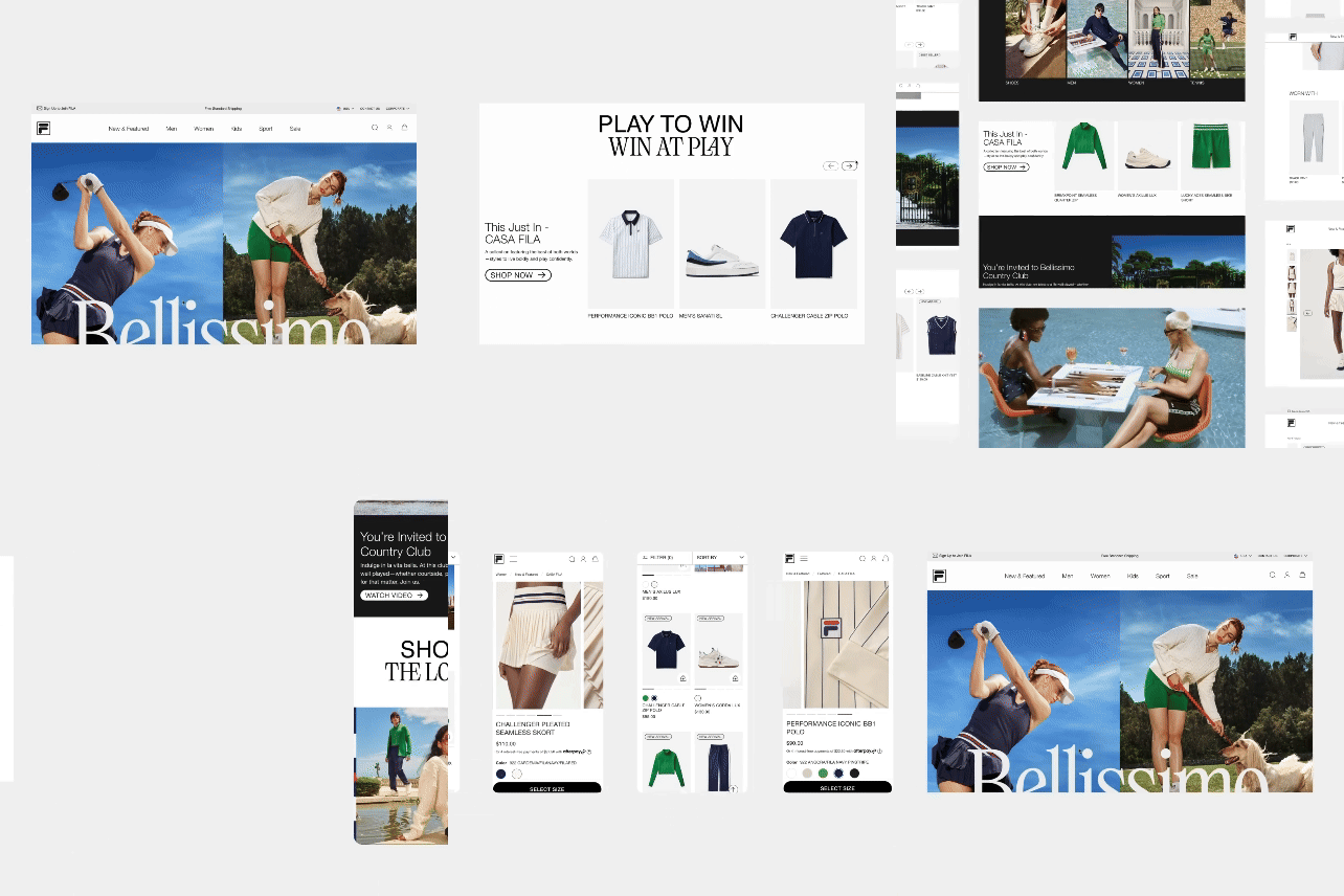
We were tasked with creating a 360 campaign for their upcoming collection to celebrate FILA’s Italian heritage. Our goal was to reintroduce the brand, reset brand perception, and reignite brand love. We created the campaign “Bellissimo”, to celebrate both grit and grace in a beautiful way.

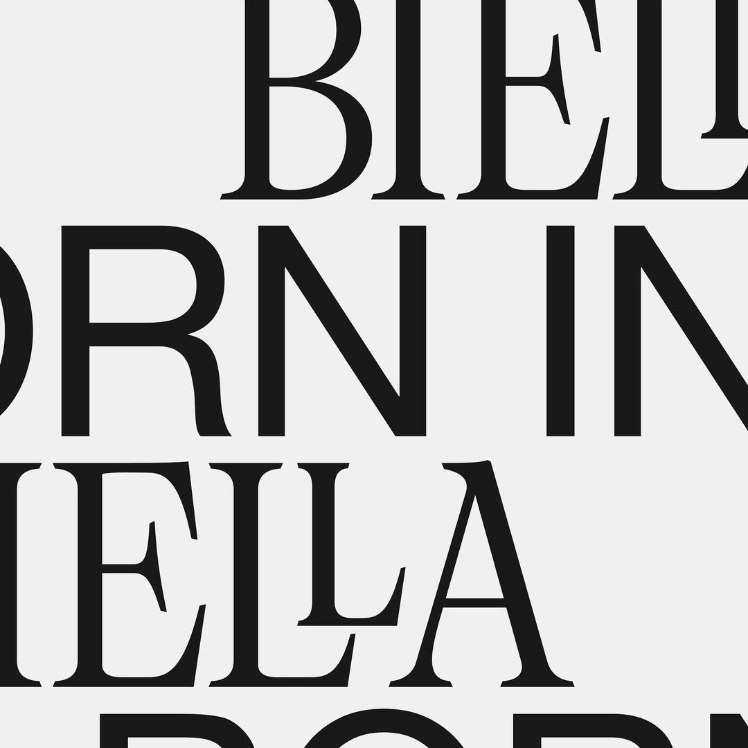
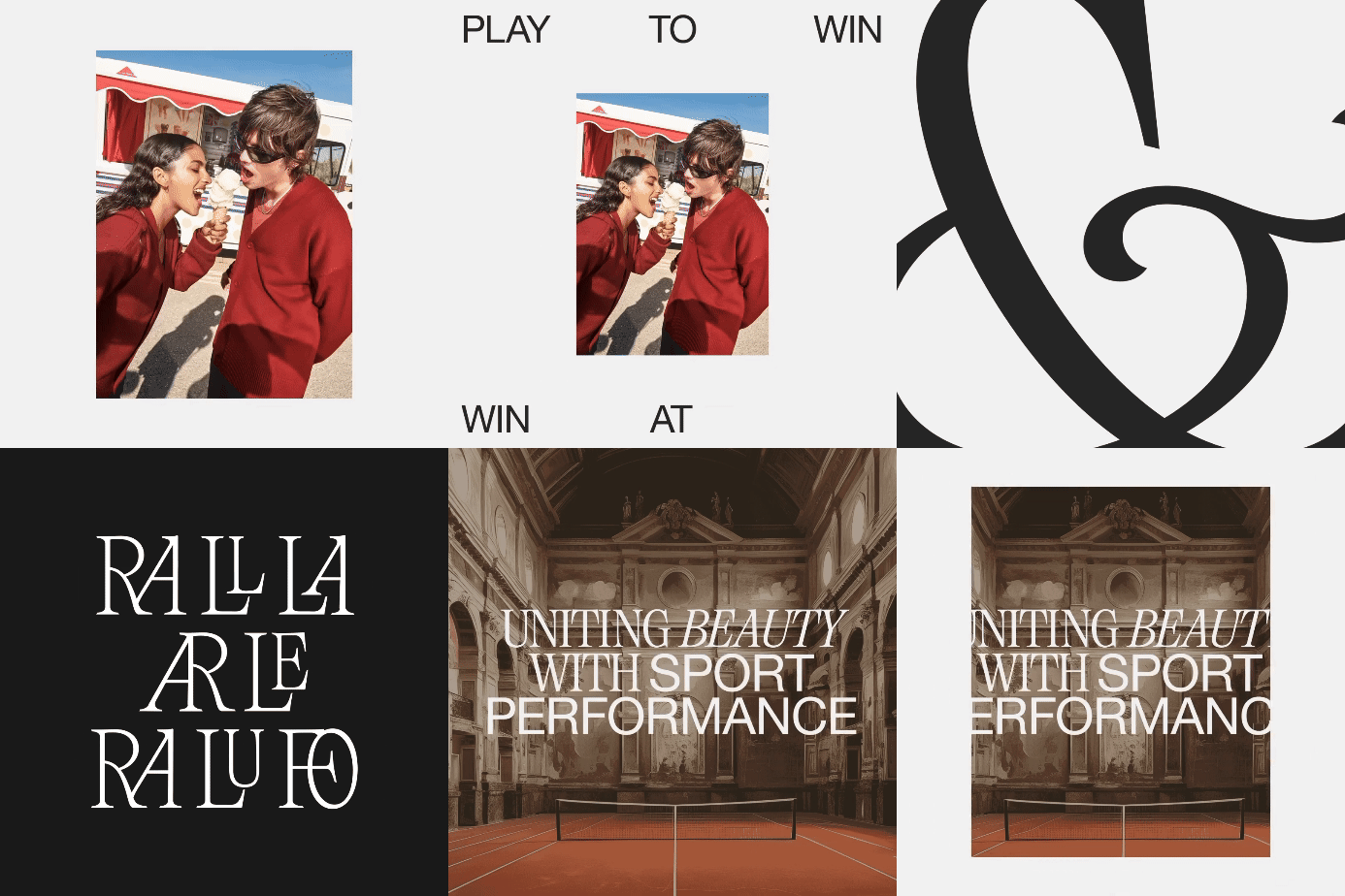
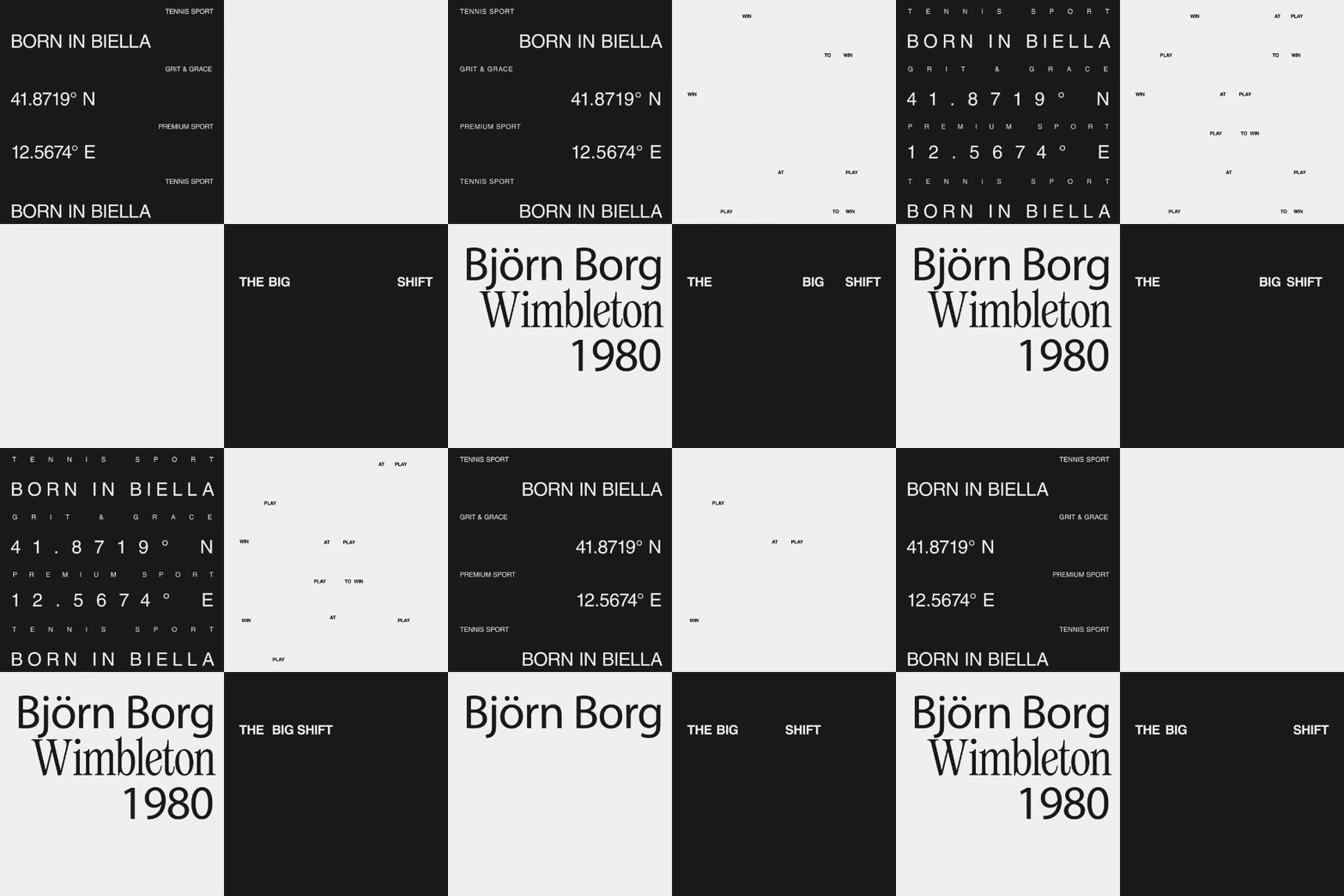
Typography - Grit and Grace
We found two distinct typefaces, sans serif paired with serif font, to illustrate the duality between grit and grace. By using them together, we can explore unique storytelling techniques and design for different categories.



The Barretta
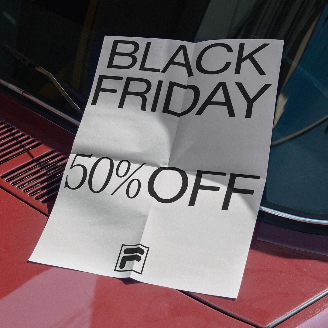
Inspired by original FILA logo, we have reimagined the Barretta—one of the brand’s most valuable assets. This transformation makes it a distinctive and ownable element.


FILA’s DNA - Stripes
We also looked into their iconic heritage stripe, which is the heart of their DNA. We chose to play with it: stretching it, creating new frames and exploring graphic layouts. The possibilities are endless.


