USCard Services (UI/UX)
Mentor: Elaine Alderette
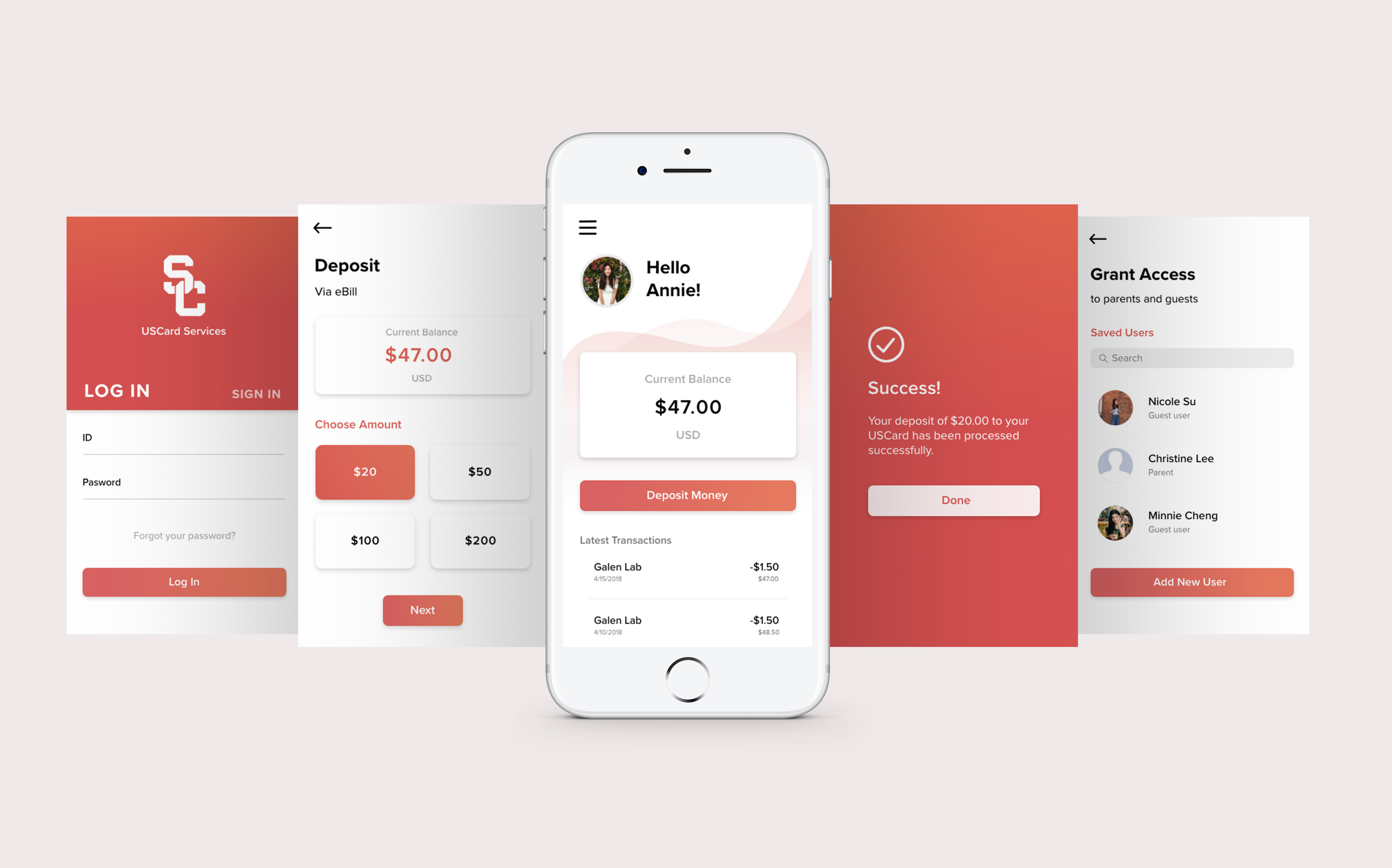
A redesign of the USCard Services app page to improve navigation and accessibility issues. Users often complained that they were unable to make a quick deposit due to complex navigation issues from the main page. There were too many tabs and information present to the users all at once, which slowed down the deposit process.
The solution was to reduce the number of clicks required to deposit money by reorganizing the menu tab and options, and making the deposit button and account balance more noticeable. The original app page incorporated USC's colors (cardinal gold and red), but these two bold colors made it even harder to distinguish options. I decided to make the primary color a red and orange gradient that still retained USC's bold logo colors.
The solution was to reduce the number of clicks required to deposit money by reorganizing the menu tab and options, and making the deposit button and account balance more noticeable. The original app page incorporated USC's colors (cardinal gold and red), but these two bold colors made it even harder to distinguish options. I decided to make the primary color a red and orange gradient that still retained USC's bold logo colors.


