Squared Away (Branding, Identity)
Agency: Studio Mococo
Everyone knows that searching for a misplaced item, or rooting through a poorly organized cabinet is rarely an enjoyable activity. But for so many people, maintaining an organized and functional home feels completely unattainable. In an effort to tackle the universal problem of clutter, Bed Bath & Beyond wanted a storage and organization brand that inspired better spaces for more enjoyable living.
Squared Away was established as Bed Bath & Beyond's exclusive line of beautifully designed, hard-working goods that put a tidier, happier home within reach. With smart storage solutions and thoughtfully-made cleaning supplies, Squared Away helps customers keep their homes working in their favor. Whether it's a room that needs reorganizing, or a drawer that needs un-cluttering, nearly every space in the home can benefit with Squared Away's help.
Squared Away was established as Bed Bath & Beyond's exclusive line of beautifully designed, hard-working goods that put a tidier, happier home within reach. With smart storage solutions and thoughtfully-made cleaning supplies, Squared Away helps customers keep their homes working in their favor. Whether it's a room that needs reorganizing, or a drawer that needs un-cluttering, nearly every space in the home can benefit with Squared Away's help.

Logo
Squared Away’s identity was inspired by the precision of Japanese design and the modular functionality of many of the products themselves. The logomark is an abstract representation of the lines created by a thoughtfully organized space. Additionally, the lines form a hidden S and A in honor of the brand’s name.
Color and Typography
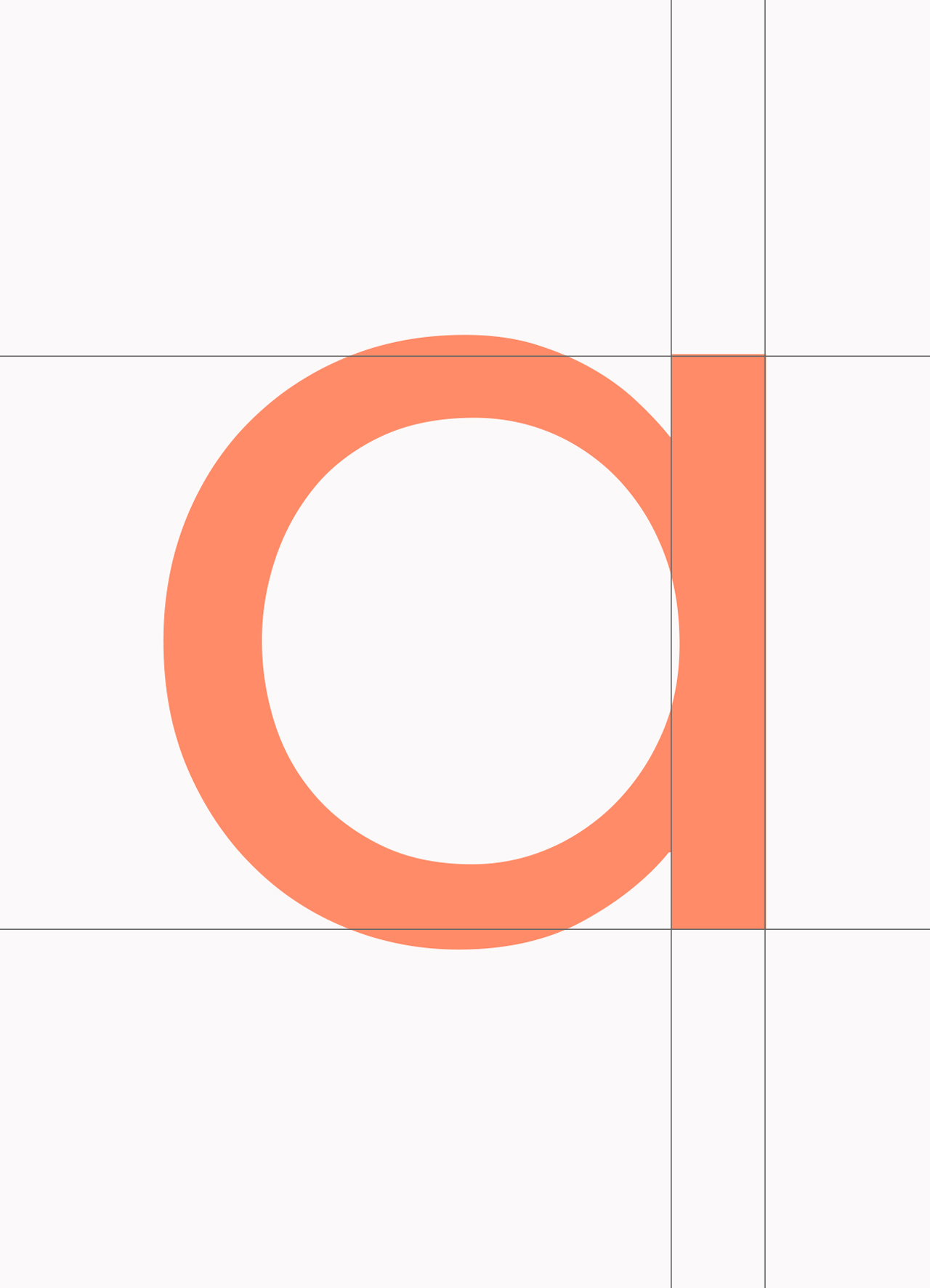
The Squared Away brand was built to serve as an antidote to the stress and anxiety caused by disorganization and clutter. With a geometric typeface and refreshing colors, Squared Away's brand feels clean, calming and understated.
![]()
![]()


